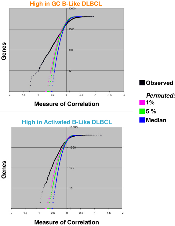
Neighborhood analysis, as per Golub et al. (1999) demonstrates that the GC B-Like versus Activated B-Like DLBCL distinction is well supported by the data.
Neighborhood analysis was performed on data from Figure 1. The "correlation" of each gene vector was compared with the GC B-Like vs. the Activated B-Like vector using the class distinction score of Golub et al. This score is the difference between the mean expression level within each disease divided by the sum of the standard deviations within each disease. Neighborhood of different size are plotted along the X-axis (larger values represent smaller/tighter neighborhoods). The 0.01, 0.05 and 0.5 (i.e., median) significant levels for different neighborhood sizes (based on 400 random permutations of the category assignments) are also plotted. The two graphs represent genes more abundantly expressed in GC B-Like and Activated B-Like DLBCL respectively. For GC B-Like DLBCL, there are approximately 550 genes within the neighborhood with a separation score of 0.25 (the point where the observed curve crosses the 0.01 significance level), while for the Activated B-Like DLBCL there are approximately 1,000 genes within the neighborhood with a separation score of 0.2 (again, where the observed and 0.01 significance curves cross).