Home
Return to the LLMPP Homepage
Explorer
Interactively explore the figures
Search
Search the LLMPP Microarray dataset
Figures
View figures from the paper
Analysis
Data analysis methods and links
Supplement
View additional tables & figures
Help
Get help with interpretation of the data
Download
Download the primary data
Authors
List of authors
|
|
|
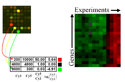
- How do I interpret the red and green images?
The data for one gene corresponds to one row, and each experiment is represented by a column. The ratio of induction/repression is such that the magnitude is indicated by the intensity of the colors displayed. If the color is black then the ratio of control to experimental cDNA is equal to 1, while the brightest colors (red and green) represent a ratio of 8 to 1 or higher (ie, ratios greater than 8 are displayed as the brightest color). In all cases red indicates an increase in mRNA abundance while green indicates a decrease in abundance in the experimental sample with respect to the control. Gray areas (when visible) indicate absent data, or data of low quality.

- How is the similarity between two genes determined?
The similarity of two genes in expression space is determined by
calculating a distance measure across all experimental values. For
this we are using the Pearson correlation coefficient.
- Problems viewing images
We recommend that you upgrade to the latest browser versions. For
Netscape
this is version 4.51 for PowerPC Macintoshes, and Windows95/98
PCs. For 68K Macintoshes, and Windows 3.1 PCs you should get Netscape
version 4.08. If you use Internet
Explorer you should use version 4.5 on a Mac, and version 5.0 on a
PC. If you still have problems then it may be that your computer
doesn't have enough memory, or a fast enough processor. There are PDF
versions of all figures which are somewhat less resource
intensive.
|
|


